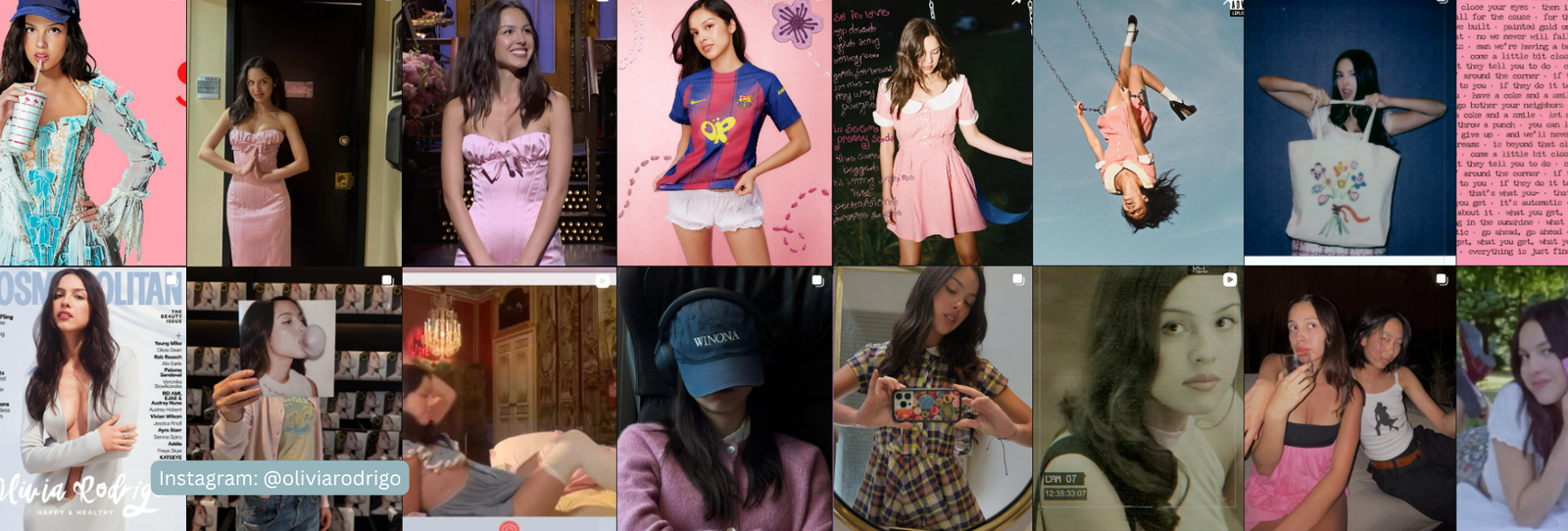
Purple shows up everywhere in Olivia Rodrigo’s branding — album covers, tour merch, music videos. It’s tempting to read that as a color-analysis clue. It probably isn’t one.
The Verdict
Olivia Rodrigo reads as Deep Winter: cool-leaning undertone, deep value, and high contrast between her near-black hair and fair-to-medium skin.
Correcting the Purple Assumption
Purple is a signature color across her SOUR and GUTS album eras. But branding doesn’t tell you a season. Purple also appears across multiple different seasonal palettes — cool, warm, muted, and bright versions all exist. So its presence alone doesn’t tell us much. Treat it as a creative and marketing choice, not diagnostic evidence.
The Evidence
Once you set the branding aside, the clearest clues are her near-black hair, dark brown eyes, and fair-to-medium skin with a cool-toned finish — features consistent with the Winter family. Weighing those features together points to Cool or Deep Winter more than any other season.
Worth Noting
Deep Winter and Cool Winter are close neighbors, and the call between them comes down to how much weight you give her hair’s depth versus her skin’s coolness. We went with Deep Winter for the value and contrast evidence, but Cool Winter is a reasonable, closely related alternative.
3 Looks That Would Support a Deep Winter Read
- True black and icy white over warm cream or camel.
- Deep jewel tones like sapphire or emerald.
- Cool-based purple, if she’s going to keep it. A clear violet reads more Deep Winter than a dusty, muted lavender would.
Where It Might Read Off
- Warm, muted neutrals like camel or rust are the first place to check if this Deep Winter read turns out to be wrong.
A Deep Winter Palette Worth Trying
| Color | Hex | Why It Works |
|---|---|---|
| True Black | #151515 | Maximum cool contrast |
| Icy White | #F3F4F6 | Crisp, not warm cream |
| Deep Violet | #43285E | Cool-based purple, not dusty |
| Sapphire Blue | #1D4C82 | Cool, rich, and clear |
| Emerald Green | #0E5A41 | Saturated and cool-based |
| Fuchsia Pink | #B22672 | Bright and cool |
| Cool Burgundy | #591E2C | Deep and cool, not warm |
| Charcoal Grey | #292C31 | A cool, high-contrast neutral |
| Silver | #B5BAC0 | Cool metallic-adjacent neutral |
| Clear Red | #B21F2C | Cool-based, not orange-leaning |
Want the full logic behind this palette? See our complete Deep Winter color palette guide.
FAQ
Has Olivia Rodrigo confirmed she’s a Deep Winter?
No. This is Colormaxxing’s own styling analysis based on her public appearances — an informed opinion, not a confirmed or endorsed result.
Why Deep Winter and not Cool Winter?
Both are reasonable. We weighted the value and contrast evidence more heavily, but Cool Winter is a close, plausible alternative.
Does her purple branding prove her season?
Not on its own. Purple exists across multiple seasonal palettes, so a single signature color isn’t enough evidence by itself.
Curious what your own season actually is? Start here to find your personal colors, or browse the shop.
Disclaimer: The color season discussed in this article is Colormaxxing’s own styling analysis based on public appearances. It is informed opinion, not verified or confirmed by Olivia Rodrigo or her representatives, and is not intended to imply endorsement.