Deepika Padukone’s dramatic, high-contrast coloring makes her a genuinely interesting case — it can read as either Winter or Autumn depending on how you weight the evidence. Here’s how we called it.
The Verdict
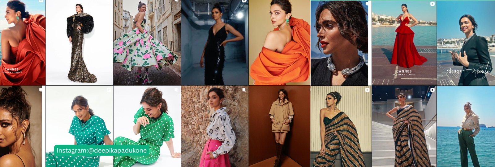
Deepika Padukone reads as Deep Autumn: warm-golden undertone, dark warm-brown hair and eyes, and medium-to-high contrast.
The Evidence
Her warm golden-tan skin, dark warm-brown hair and eyes, and medium-high contrast point toward Deep Autumn. Saturated, earthy tones like burnt orange, mahogany, deep teal, and garnet tend to bring out that richness rather than flatten it. Her dramatic look is sometimes read as a Deep Winter, but the underlying undertone is warm-golden rather than cool.
Worth Noting
Bright Winter is a real, well-reasoned alternative here. Her coloring has a bright, clear luminosity that some would weight toward Winter’s brightness rather than Autumn’s depth. We went with Deep Autumn because the undertone evidence leans warm, but Bright Winter is worth knowing about if your own eye reads her differently.
3 Looks That Would Support a Deep Autumn Read
- Burnt orange or mahogany over icy pastels.
- Deep teal or garnet instead of cool jewel tones.
- Warm gold jewelry rather than silver.
Where It Might Read Off
- Cool, icy brights are the first place to check if the Bright Winter alternative turns out to be closer.
A Deep Autumn Palette Worth Trying
| Color | Hex | Why It Works |
|---|---|---|
| Burnt Orange | #B9541F | Rich, warm, and deep |
| Mahogany | #6B2E1E | Deep, warm neutral |
| Deep Teal | #1D5C55 | Warm-leaning, saturated blue-green |
| Garnet Red | #7A1F2B | Deep, warm-based red |
| Golden Ochre | #B8842E | Rich, warm gold |
| Espresso Brown | #3B2418 | Deep, warm neutral |
| Olive Green | #5C6B2E | Deep, warm-based green |
| Rust | #A6461C | Warm, saturated accent |
| Deep Amber | #C17B24 | Warm and glowing |
| Warm Camel | #8A5A34 | Deep, warm neutral |
Want the full logic behind this palette? See our complete Deep Autumn color palette guide.
FAQ
Has Deepika Padukone confirmed she’s a Deep Autumn?
No. This is Colormaxxing’s own styling analysis based on her public appearances — an informed opinion, not a confirmed or endorsed result.
Why is there room for disagreement about her season?
Her coloring is dramatic and high-contrast, which can read as “deep” or “bright” depending on how you weight warmth versus clarity. Both are reasonable interpretations of the same features.
Why not go with Bright Winter instead?
It’s a real, well-reasoned alternative. We leaned Deep Autumn because the undertone evidence points warm, but it’s not a closed question.
Curious what your own season actually is? Start here to find your personal colors, or browse the shop.
Disclaimer: The color season discussed in this article is Colormaxxing’s own styling analysis based on public appearances. It is informed opinion, not verified or confirmed by Deepika Padukone or her representatives, and is not intended to imply endorsement.