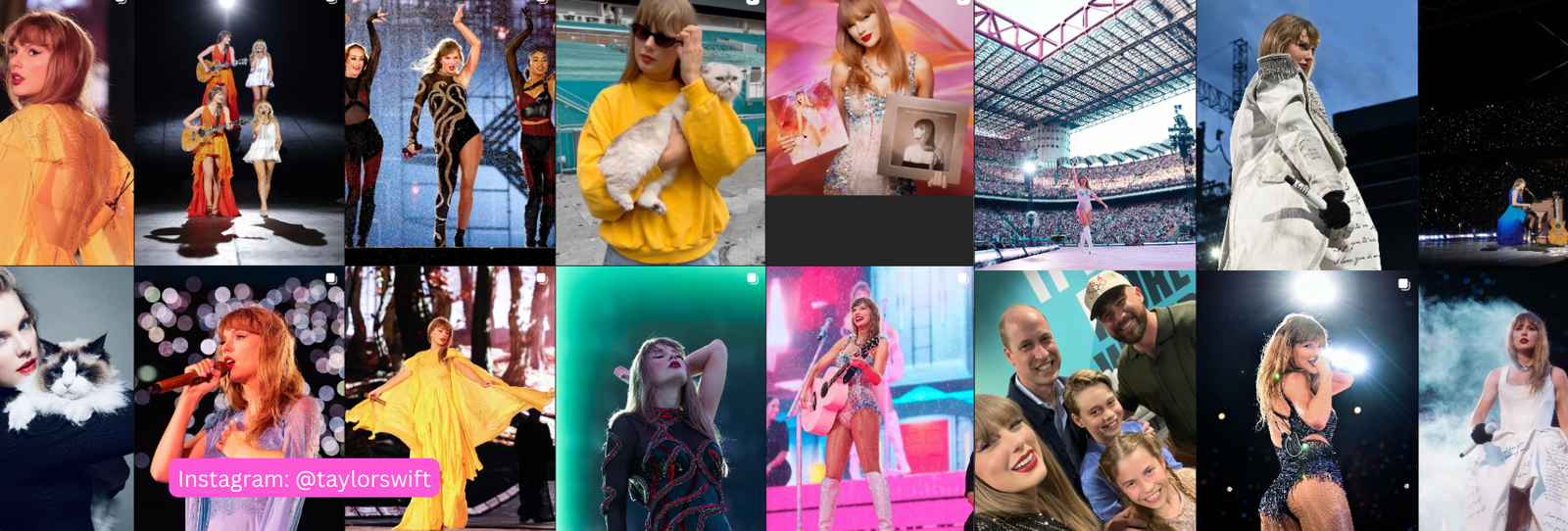
Taylor Swift has been photographed in nearly every color imaginable across two decades of eras. That actually makes her a good test case for color analysis — there’s enough variation to see what genuinely works versus what’s just “the Eras Tour aesthetic” for that record cycle.
The Verdict
The best-supported read across multiple independent color-analysis sources is Light Spring: warm undertone, light value, and a soft-to-clear chroma rather than the saturated brightness of Bright Spring. It’s not unanimous — more on that below — but it’s the most consistently cited answer.
The Evidence
Several English-language color-analysis creators and sites, independently of each other, have pointed to the same markers: her warm, golden-blonde natural coloring, light-to-medium skin, and best-received red-carpet moments — warm coral, golden champagne, peachy tones. Those are classic Light Spring markers. The recurring theme across sources is that she looks most alive in warm, light, clear colors — and noticeably flatter in anything heavy, cool, or overly muted.
Worth Noting
This isn’t unanimous. Some sources argue for Bright Spring, pointing to eras where she’s worn more saturated, high-energy color and pulled it off — sequins, bold red lip, vivid jewel tones during certain tour segments. Others argue for Light Summer, noting that her cooler, ash-blonde styling eras (parts of the “evermore”/”folklore” aesthetic) also photographed well. Both alternate readings are plausible enough that we’re presenting Light Spring as the best-supported answer, not a settled one.
3 Looks That Would Nail the Season
- Warm coral and peach over anything blue-based red — a recurring flattering choice across her red-carpet history.
- Golden champagne and warm ivory instead of stark white or icy platinum.
- Light, clear warm blue (think periwinkle) rather than a muted or dusty blue.
Where It Reads a Little Off
- Heavy, cool jewel tones like deep emerald or true burgundy tend to overwhelm rather than flatter a Light Spring palette.
- All-black styling, while a red-carpet staple for many stars, is generally the hardest look for this season to pull off at full intensity.
A Light Spring Palette Worth Trying
| Color | Hex | Why It Works |
|---|---|---|
| Warm Coral | #F0866B | Lively without going saturated |
| Golden Champagne | #E8CD9A | Warm, light, and luminous |
| Peach Blossom | #F4B79C | Soft warmth, classic Light Spring |
| Clear Periwinkle | #7C93D6 | A cool accent light enough to stay in family |
| Warm Ivory | #F6EBD9 | Softer than stark white |
| Light Turquoise | #6FC2BC | Bright but not heavy |
| Soft Marigold | #E8B84B | A warm, energetic accent |
| Fresh Watermelon | #EE7C81 | Warm-leaning pink-red |
| Light Moss | #A9BB80 | Soft warm green |
| Buttercream | #F1DCA8 | A warm, high-value neutral |
Want the full logic behind this palette? See our complete Light Spring color palette guide.
FAQ
Has Taylor Swift had an official color analysis?
Not that’s been publicly confirmed by her team. This read is built from styling patterns and independent color-analysis commentary, not a diagnosis from her.
Why not Bright Spring, since she wears bold color well?
Bright Spring is a real alternate reading some sources argue for. We went with Light Spring because it’s the more consistently cited answer, but it’s genuinely contested.
Does her hair color affect this read?
Hair color is styling, not undertone — her natural warm-blonde coloring is more relevant here than any given era’s dye job.
Curious what your own season actually is? Start here to find your personal colors, or browse the shop.
Season reads for public figures are educated inferences from public photos and reporting, not confirmed diagnoses. Use them as a starting point for your own color discovery, not a final answer.