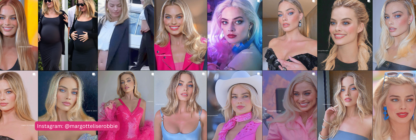
Margot Robbie wore hot pink for an entire press tour. The internet decided that settled it: Barbie pink must be her color. The real evidence tells a slightly different story.
The Verdict
The best-supported read is Light Spring: warm undertone, light value, and a clear rather than muted chroma. This is the most consistently supported classification we found in this entire batch of research.
The Evidence
A UK-based image consulting business assigns her Light Spring specifically. It cites a light, warm complexion with subtle golden undertones, warm blonde hair with honey highlights, and clear blue-green eyes. A TikTok creator independently made a comparative argument for the same season. The reasoning: Robbie looks slightly washed out in Light Summer swatches but visibly “lifts” in Light Spring colors.
Multiple AI-directory sites, working independently of each other, land on the same Light Spring answer. That’s a stronger convergence than most celebrities in this series get. Still, none of these sources individually carry much weight on their own.
Correcting the Barbie Pink Assumption
Here’s the twist: Sterling Style Academy, an image-consultant training academy, notes that warm-undertone people are generally better served by peachy or salmon pinks. Cool-leaning fuchsia or magenta tends to suit them less. Barbie’s saturated hot pink sits closer to that cooler, more intense end.
No source directly says “hot pink is wrong for her.” She clearly made it work as a character and a campaign. But the more precise answer to “was Barbie pink actually her color?” is: probably not exactly. A warmer, peachier pink would likely flatter her natural coloring more than the saturated magenta-pink of the Barbie press tour.
3 Looks That Would Nail the Season
- Peachy pink and coral over saturated magenta or fuchsia.
- Warm golden yellow instead of a cool lemon.
- Clear, warm turquoise rather than an icy or muted blue.
Where It Reads a Little Off
- Cool-toned jewel shades like fuchsia or true blue tend to compete with her coloring rather than complement it.
- Heavy black can look more severe on her than the lightness of a Light Spring palette would predict.
A Light Spring Palette Worth Trying
| Color | Hex | Why It Works |
|---|---|---|
| Peach Blossom | #F2B08F | Warm and light, not saturated |
| Coral Pink | #EE8A7D | Warmer and softer than fuchsia |
| Warm Marigold | #E9B44C | A clear, warm accent |
| Golden Champagne | #E7CC97 | Warm, light, and luminous |
| Clear Turquoise | #5CBFB5 | Bright but not icy |
| Warm Ivory | #F5EAD6 | Softer than stark white |
| Light Periwinkle | #7E96D9 | A cool accent light enough to fit |
| Fresh Watermelon | #EF7E82 | Warm-leaning, not cool pink |
| Buttercream | #F1DBA5 | A warm, high-value neutral |
| Light Moss | #A9BB7D | Soft warm green |
Want the full logic behind this palette? See our complete Light Spring color palette guide.
FAQ
So was Barbie pink actually Margot Robbie’s color?
Not exactly. The evidence points to a warm undertone. That undertone is better served by peachy or coral pinks than by Barbie’s saturated, cooler-leaning magenta.
Has Margot Robbie had an official color analysis?
Not publicly confirmed, but the Light Spring read here has more independent convergence than most celebrities we’ve covered.
Why is this one of the better-supported reads in the series?
A named image consultant, a comparative TikTok analysis, and multiple independent AI sources all land on the same answer. That’s unusually consistent for this kind of research.
Curious what your own season actually is? Start here to find your personal colors, or browse the shop.
Season reads for public figures are educated inferences from public photos and reporting, not confirmed diagnoses. Use them as a starting point for your own color discovery, not a final answer.