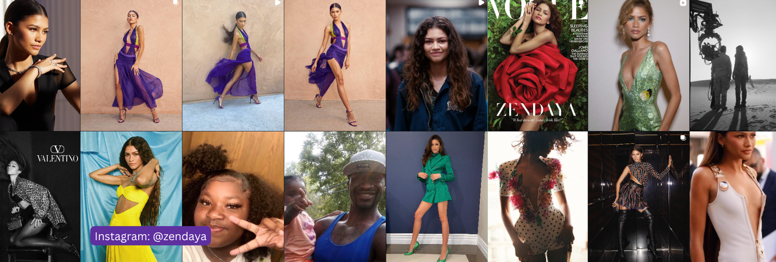
Zendaya has one of the more analyzed color profiles in this series, with actual competing methodologies weighing in rather than just vibes. That makes her a genuinely interesting case rather than a simple verdict.
The Verdict
The best-supported read is Deep Autumn: warm undertone, deep value, and rich rather than muted chroma. This comes from Vivaldi Color Lab’s digital drape testing, a more rigorous method than most sources in this series get to draw on.
The Evidence
Vivaldi Color Lab’s digital drape comparison tested Zendaya against both Deep Autumn and Deep Winter drapes. It found the warm, rich Deep Autumn palette consistently more flattering — brightening her skin and softening contrast in a way the cooler Deep Winter drapes didn’t. Digital draping isn’t a perfect substitute for an in-person consultation, but it’s a real, testable methodology rather than a guess from photos.
Worth Noting
This isn’t unanimous. Colorist Zazu Feu has argued for a lighter, warmer read than Deep Autumn, suggesting her coloring may sit closer to a Warm Spring or Warm Autumn than the deeper end of the spectrum. Separately, a TikTok creator’s analysis proposed Deep Summer — deep value but cool rather than warm undertone — which would put her in an entirely different family. We’re presenting Deep Autumn as the best-supported answer because of the drape-test evidence. But genuinely credentialed voices disagree, and that’s worth knowing before you take this as settled.
3 Looks That Would Nail the Season
- Rich chocolate brown and bronze over anything icy or pastel — a recurring flattering choice in her red-carpet history.
- Deep, warm jewel tones like emerald-with-warmth or burnt orange rather than cool jewel tones.
- Warm gold jewelry instead of cool silver or platinum.
Where It Reads a Little Off
- Icy pastels tend to wash out a Deep Autumn palette rather than complement it.
- Cool, silvery tones are the first place to look if the Deep Autumn read turns out to be wrong in favor of Zazu Feu’s lighter alternative.
A Deep Autumn Palette Worth Trying
| Color | Hex | Why It Works |
|---|---|---|
| Chocolate Brown | #4A2F23 | Deep, warm, and grounded |
| Burnt Sienna | #A8502E | Rich warm accent with depth |
| Deep Bronze | #8A5A2E | Warm metallic-adjacent neutral |
| Forest Green | #3D5A34 | Deep, warm-based green |
| Rich Rust | #9C4A28 | Warm and saturated without being harsh |
| Espresso | #3A2A1E | A deep warm neutral |
| Warm Mustard | #B9902E | Deep, confident warm accent |
| Deep Teal | #2E5C56 | Warm-leaning deep accent color |
| Burgundy Wine | #6E2A32 | Deep and warm, not cool-based |
| Camel Gold | #B4823E | Rich warm neutral |
Want the full logic behind this palette? See our complete Deep Autumn color palette guide.
FAQ
Has Zendaya had an official color analysis?
Not a single confirmed consultation, but she’s been the subject of more rigorous testing than most celebrities here, including digital drape comparisons.
Why not Deep Winter, since deep colors clearly work on her?
Deep Winter was directly tested against Deep Autumn in the Vivaldi Color Lab comparison, and the warmer Deep Autumn drapes were the more consistently flattering result.
Who is Zazu Feu, and why do they disagree?
A colorist who has argued for a lighter, warmer read closer to Warm Spring or Warm Autumn. It’s a credible alternate view, which is why we’re flagging the disagreement rather than ignoring it.
Curious what your own season actually is? Start here to find your personal colors, or browse the shop.
Season reads for public figures are educated inferences from public photos and reporting, not confirmed diagnoses. Use them as a starting point for your own color discovery, not a final answer.