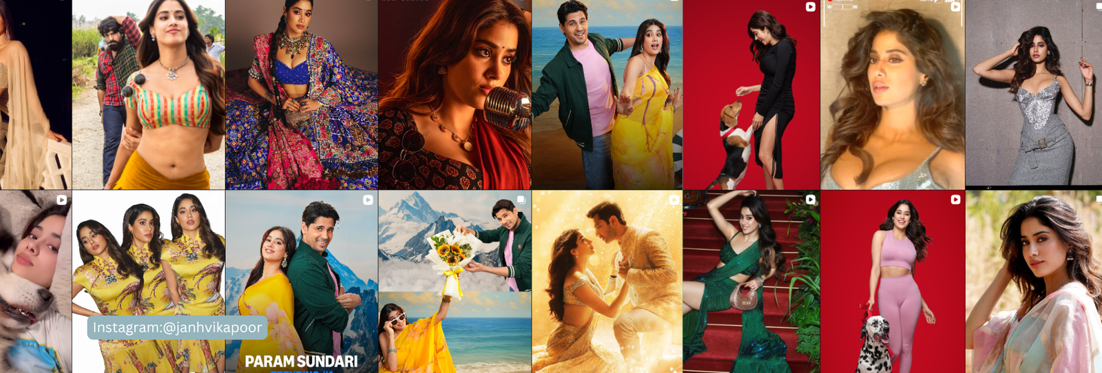
Janhvi Kapoor’s red-carpet and event looks lean into warm, earthy jewel tones — amber, terracotta, deep emerald. That’s a consistent pattern, and it lines up with her underlying coloring.
The Verdict
Janhvi Kapoor reads as Warm Autumn: honeyed, neutral-warm undertone with soft contrast.
The Evidence
Her complexion carries a honeyed, neutral-warm undertone with soft rather than sharp contrast between her hair, skin, and eyes. Glowing spice shades — marigold, terracotta, emerald velvet, soft coral, gilded bronze — bring out that warmth well, while icy blues and stark white tend to fight it.
3 Looks That Would Support a Warm Autumn Read
- Terracotta or marigold over icy pastels.
- Emerald velvet instead of cool-toned jewel tones.
- Cognac or olive neutrals rather than stark white.
Where It Might Read Off
- Icy blues and stark whites are the first place to check if her undertone runs cooler than this read suggests.
A Warm Autumn Palette Worth Trying
| Color | Hex | Why It Works |
|---|---|---|
| Marigold Glaze | #E0A233 | Warm, vivid accent |
| Terracotta | #B5602E | Warm and earthy |
| Emerald Velvet | #1F5C42 | Rich, warm-leaning green |
| Soft Coral | #D97B62 | Warm and soft, not bright |
| Gilded Bronze | #9C6B2E | Warm metallic-adjacent neutral |
| Cognac | #7A4A22 | A rich, warm neutral |
| Warm Olive | #6B7233 | Warm, muted-rich green |
| Warm Charcoal | #3E362E | A deep, warm-leaning neutral |
| Amber Spice | #C1802B | Warm and glowing |
| Honey Gold | #C99339 | A warm, glowing neutral |
Want the full logic behind this palette? See our complete Warm Autumn color palette guide.
FAQ
Has Janhvi Kapoor confirmed she’s a Warm Autumn?
No. This is Colormaxxing’s own styling analysis based on her public appearances — an informed opinion, not a confirmed or endorsed result.
Does her warm-toned styling prove her season?
It’s a consistent, meaningful pattern that lines up with the undertone evidence, though styling alone is never the whole picture.
What’s the difference between Warm Autumn and Deep Autumn?
Warm Autumn is warm with moderate depth and softer intensity; Deep Autumn pushes further into darker, richer saturation. Her softer contrast points to Warm Autumn specifically.
Curious what your own season actually is? Start here to find your personal colors, or browse the shop.
Disclaimer: The color season discussed in this article is Colormaxxing’s own styling analysis based on public appearances. It is informed opinion, not verified or confirmed by Janhvi Kapoor or her representatives, and is not intended to imply endorsement.